Engaging and easy-to-grasp data visualizations
for a busy world
The eye processes visual content in 0.013 seconds.
Good visualization is a representation of data that helps you understand in an eye lash laborious content. It helps you see trends, patterns and grasp dense content.
We use data visualization to turn your numbers into a picture that will both impress and influence people. Whether you are publishing a research study, putting together an investment deck or angling for a viral blog post, your information design will go a long way.
What are infographics made of?
Infographics are visual representations of facts, events and numbers that reflect patterns. Infographics tell a story, guiding the audience to conclusions and pointing out connections. In order to achieve this, several components can be called upon, such as:


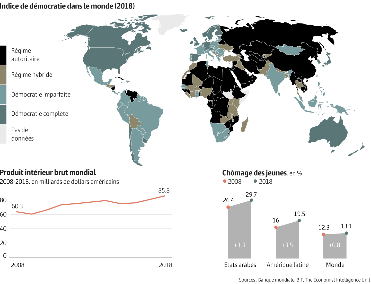
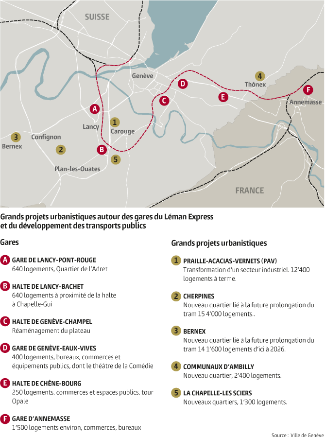
Maps
We create perfectly accurate maps at all levels, from the street to the world, that match your style guide.

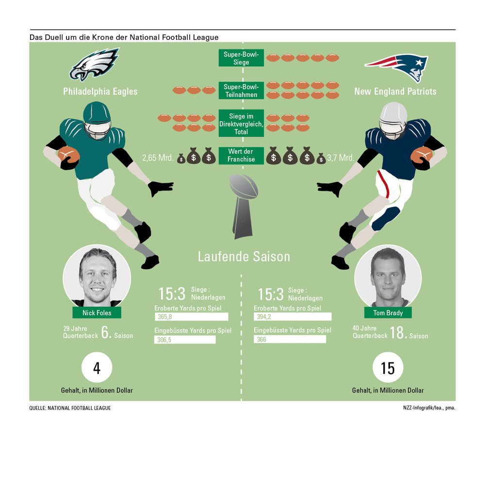
Data visualizations
Data visualizations are visual representations of numbers presented in graphic form to help your audience process their content easily.

Storytelling
Infographics turn data visualizations into narratives. They are visual representations of facts, events and numbers that reflect your story.

Facts
We select catchy facts that illustrate your topic and arouse the curiosity of your target audience.

Illustrations
Illustrations express your topic in a glimpse, in addition to bringing warmth and focus.
Our team

Pauline Martinet
Art direction & Infographics

Lukas Beyeler
Animation & Video

Amaro Koeberle
Illustration
Our realisations
We mostly work for the press, Le Temps and Neue Zürcher Zeitung.
We are always happy to work for the private sector. Just get in touch!